English Traditionalist Project Reveal Part I
There are homes that quietly hold their history, and then there are those that invite you to rediscover it. This 1940 West University Place residence falls squarely into the latter. What began as a whole-home remodel evolved into a thoughtful reimagining, one rooted in respect for the home’s traditional bones while allowing space for color, light, and modern living to step forward. From the earliest days of demolition to the final layers of styling, the goal remained consistent: to create a house that feels lived-in, welcoming, and ready for the next chapter of a family that has called it home for over two decades.
Architect: Newberry Architecture | Builder: CAM Construction | Photographer: Julie Soefer | Styling: Jessice Brinkert Holtam
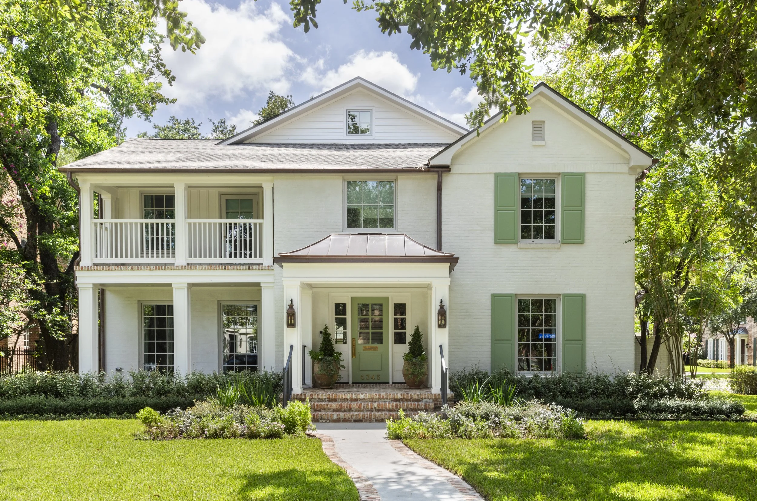
Arrival: Exterior & Foyer
The first impression is intentionally warm. A white brick exterior sets a classic foundation, softened by a green front door and matching shutters that hint at the color story inside. Copper lanterns flank the entry, catching the light just enough to feel special without tipping into formality, while oversized planters reflect the homeowners’ love of gardening and immediately give the house a lived-in, cared-for presence. Working closely with Newberry Architecture and CAM Construction, we introduced subtle exterior updates, including a copper roof over the front porch and Old Chicago brick detailing, layering in texture and age in a way that feels as though it has always belonged.
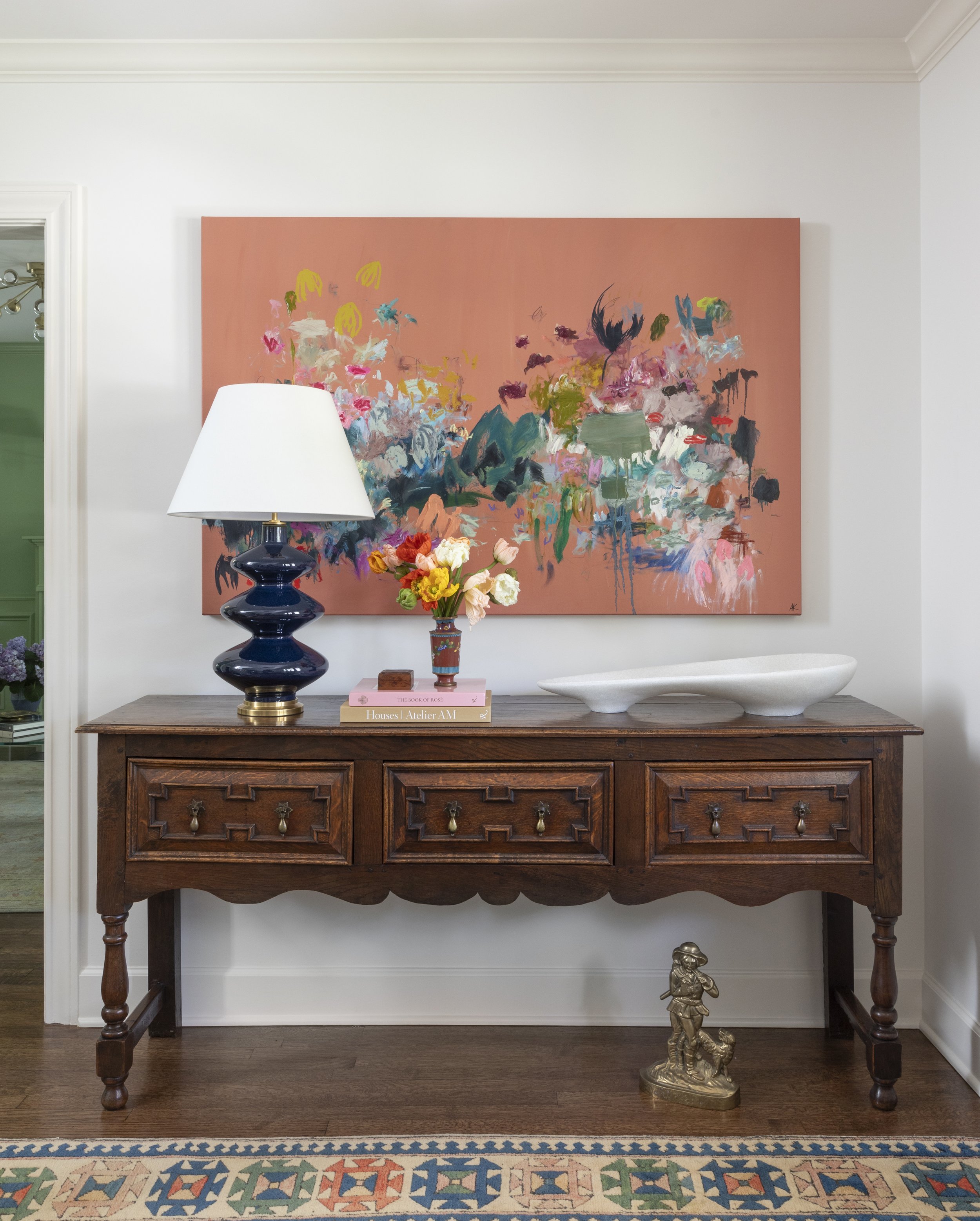
Inside, the foyer continues that sense of quiet confidence. An existing dark wood console, originally tucked away in another room, was restored and repositioned here to anchor the space. Its craftsmanship and original hardware deserved center stage, and placing it at the entry allows those details to be appreciated immediately. A vintage Turkish-style rug offsets the original hardwood floors, creating contrast and movement underfoot, while a round glass flush mount from Visual Comfort, finished in natural brass, brings a clean, refined glow overhead. Above the console, a bold abstract by AK Hardeman, sourced from Mont Art House, introduces a contemporary note, setting the tone for the dialogue between old and new that carries throughout the home.
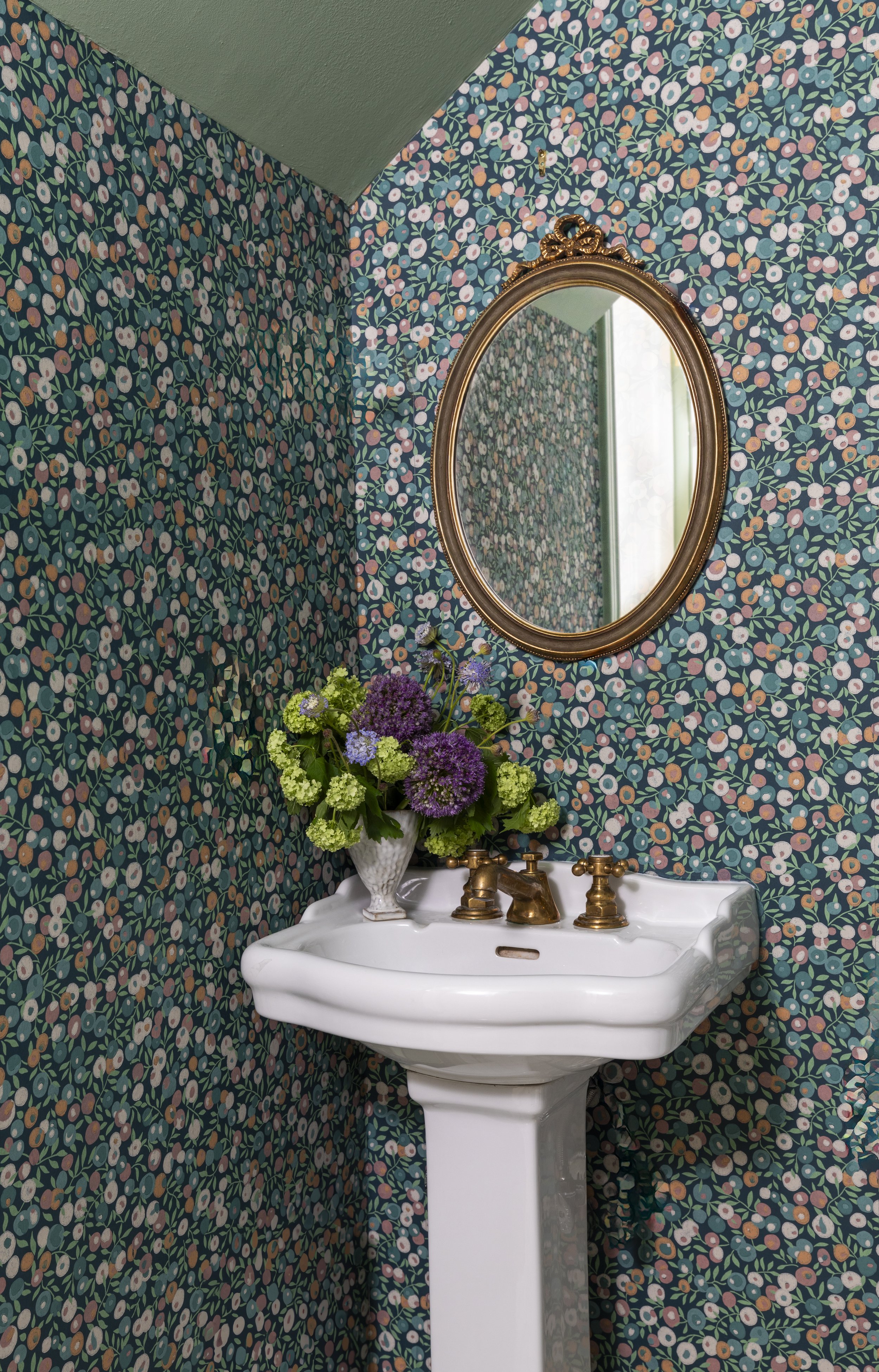
The Powder Bath
Just off the foyer, the powder bath offers a moment of surprise. Wrapped in Liberty London wallpaper from The Modern Collector collection, the space feels layered and expressive without overwhelming. The pattern reads almost floral at first glance, grounded by a rich, saturated green with subtle variation that quietly echoes the home’s exterior palette. We chose to preserve the existing floor and sconces, opting instead to polish and refresh them, allowing the character of the original materials to remain intact.
Over the pedestal sink, an antique mirror, thrifted specifically to complement the existing hardware, adds warmth and continuity, tying the room back to the home’s broader story. It’s a small space, but one that captures the larger approach of the project: honoring what was already there, refining it thoughtfully, and letting personality quietly lead the way.
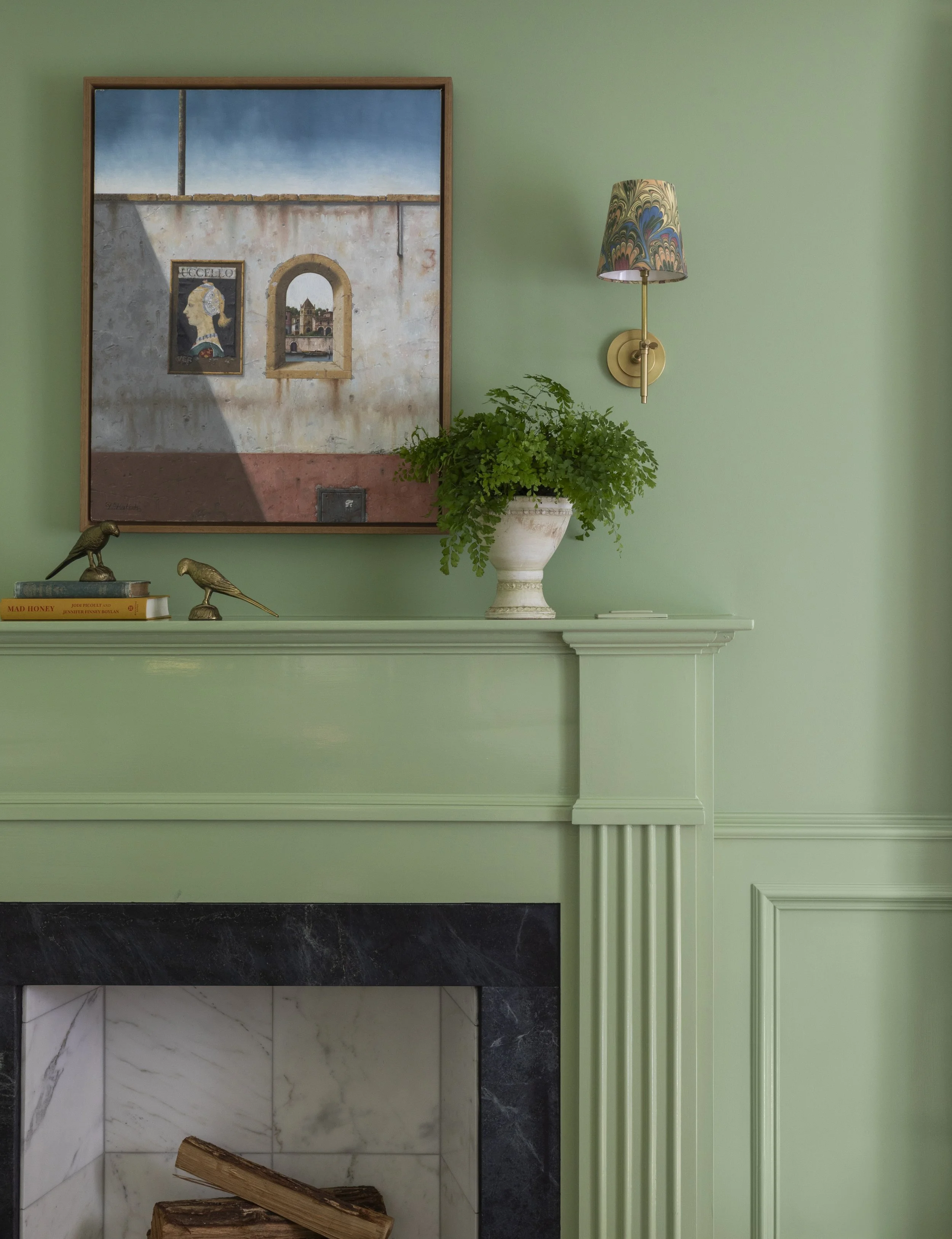
The Sitting Room
The sitting room is where the home fully leans into color, character, and conversation. Enclosed by original stained glass paneled doors, painted a rich green, the room feels intentionally set apart—almost like a jewel box tucked just off the main circulation. That same green carries through the walls and fireplace, giving depth to what could have otherwise read as a flat plane, and reinforcing the playful color moments first introduced on the exterior.
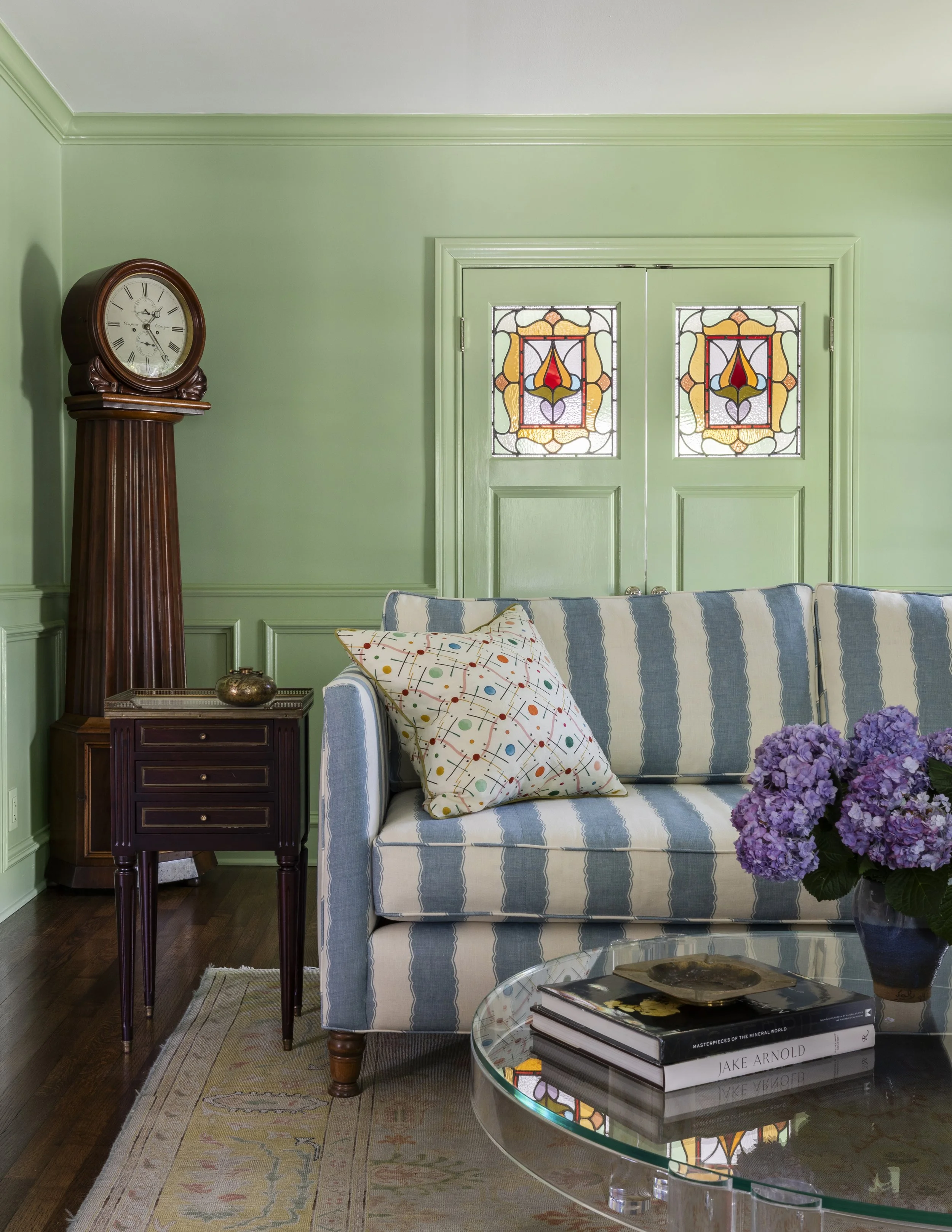
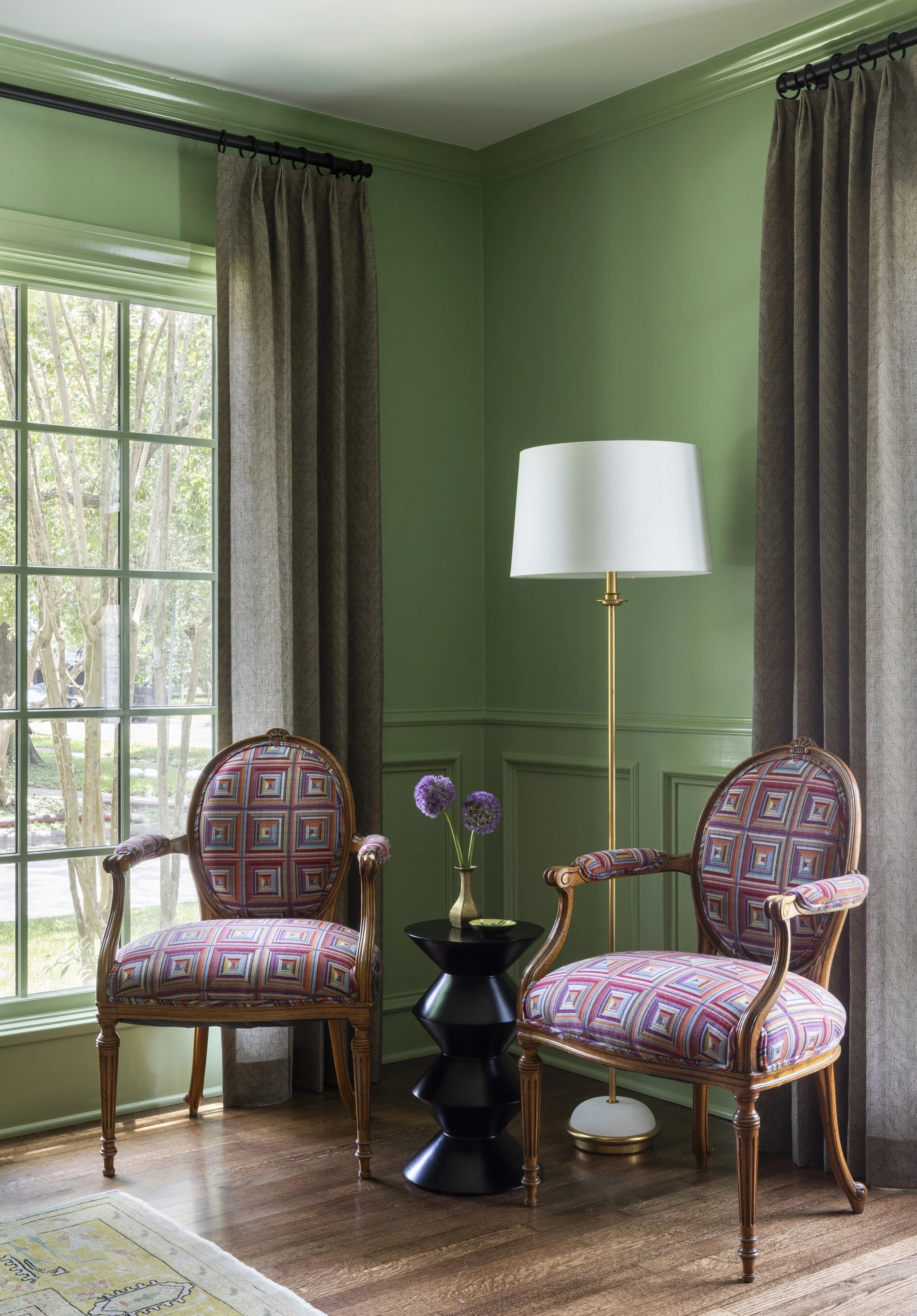
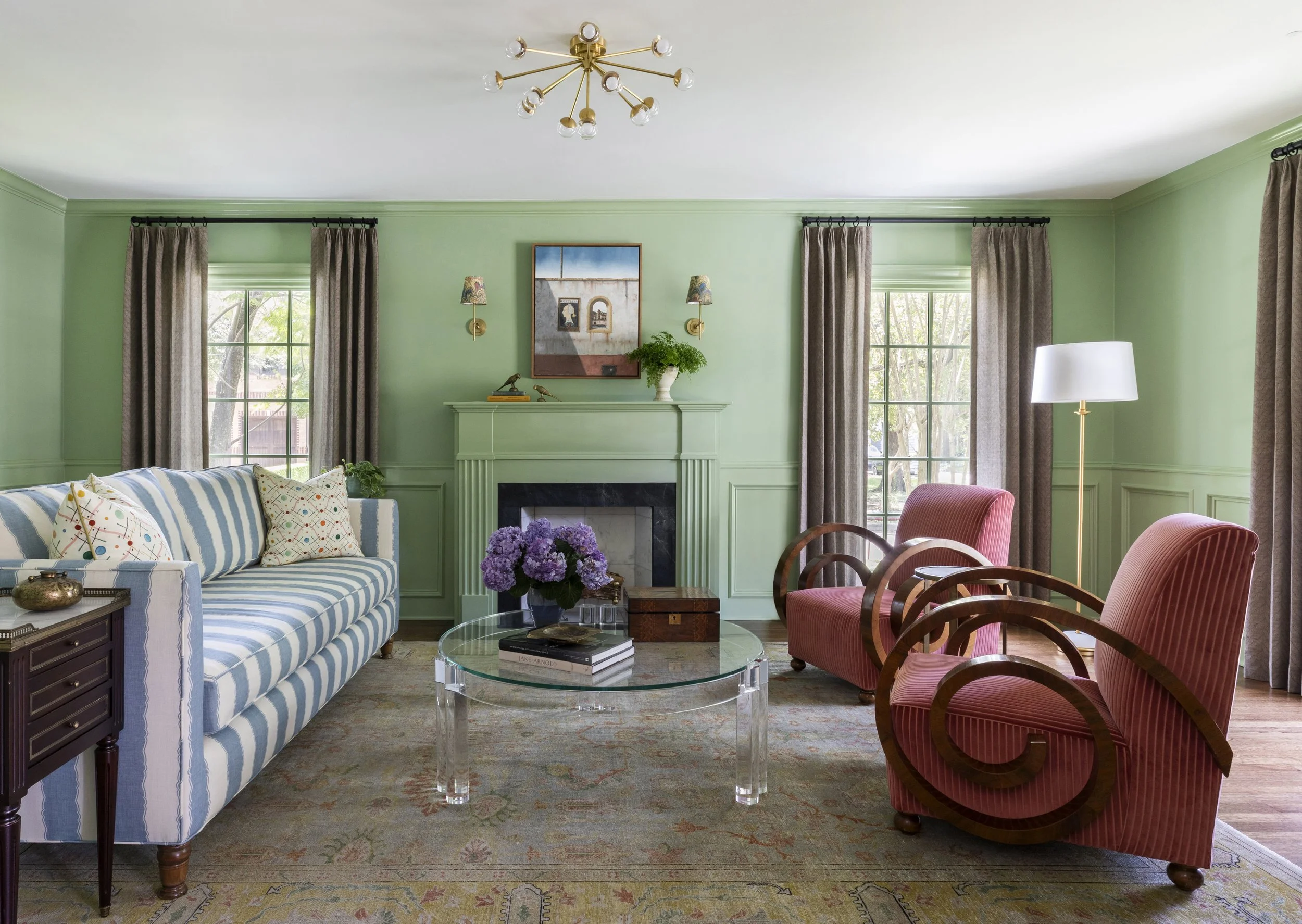
The furnishings in this room tell a layered story, blending pieces the client already owned with carefully selected vintage and antique finds, all reupholstered to strike a balance between tradition and freshness. Two lounge chairs, wrapped in a salmon-toned pinstripe velvet, bring softness and movement, their swirled armrests adding a sculptural quality that feels collected rather than precious. The main sofa, dressed in a crisp blue-and-white stripe, grounds the room, while a pair of chairs upholstered in a bold geometric fabric create a cozy vignette near the windows, a room within the room, perfect for quieter moments.
Lighting plays its own supporting role. Fun, patterned lampshades from Houses & Parties add levity and warmth, reinforcing the idea that a traditional space doesn’t have to feel stiff or predictable. Together, the layered upholstery, saturated color, and varied textures create a room that feels confident and lived-in, one that invites lingering rather than formality.
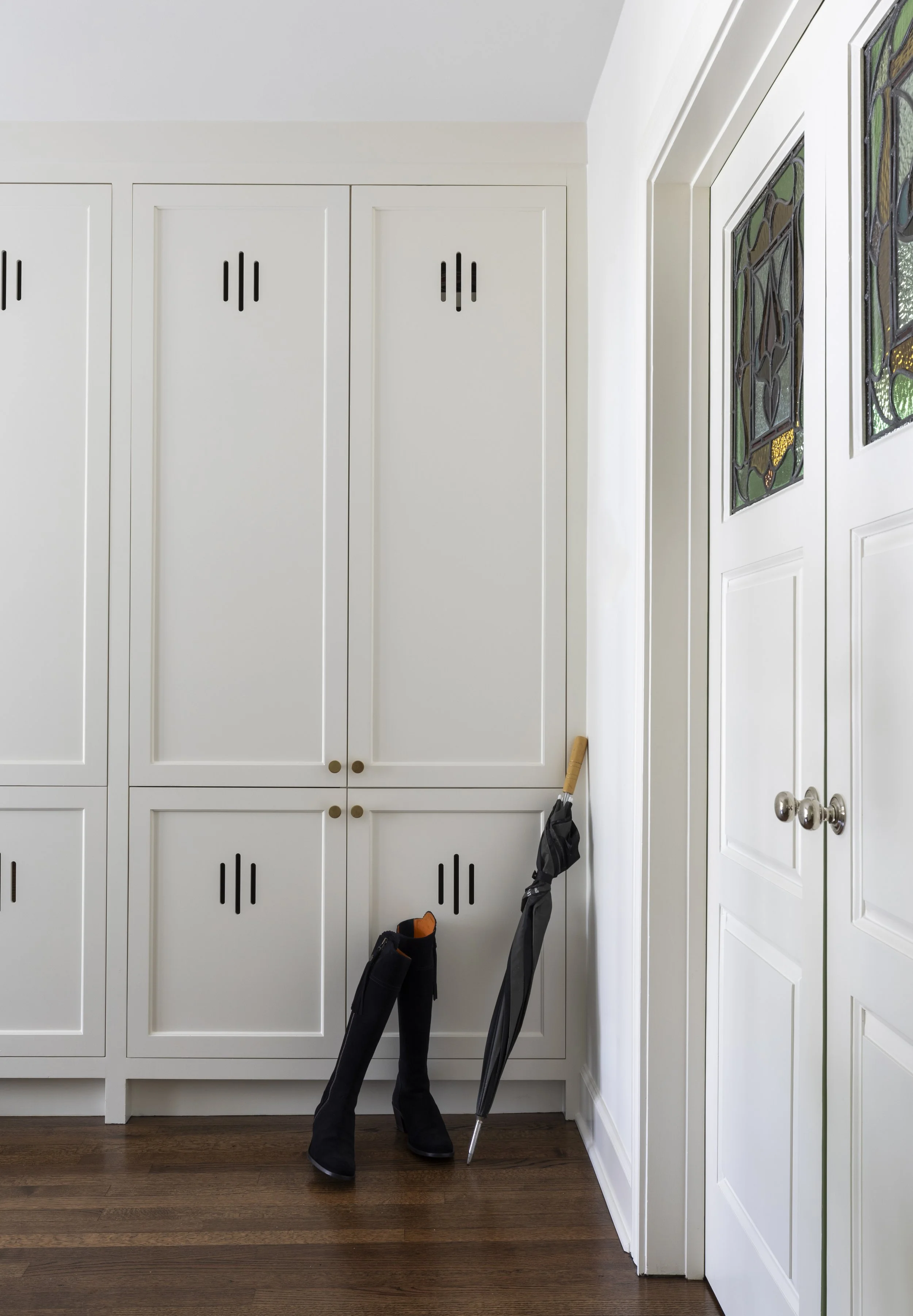
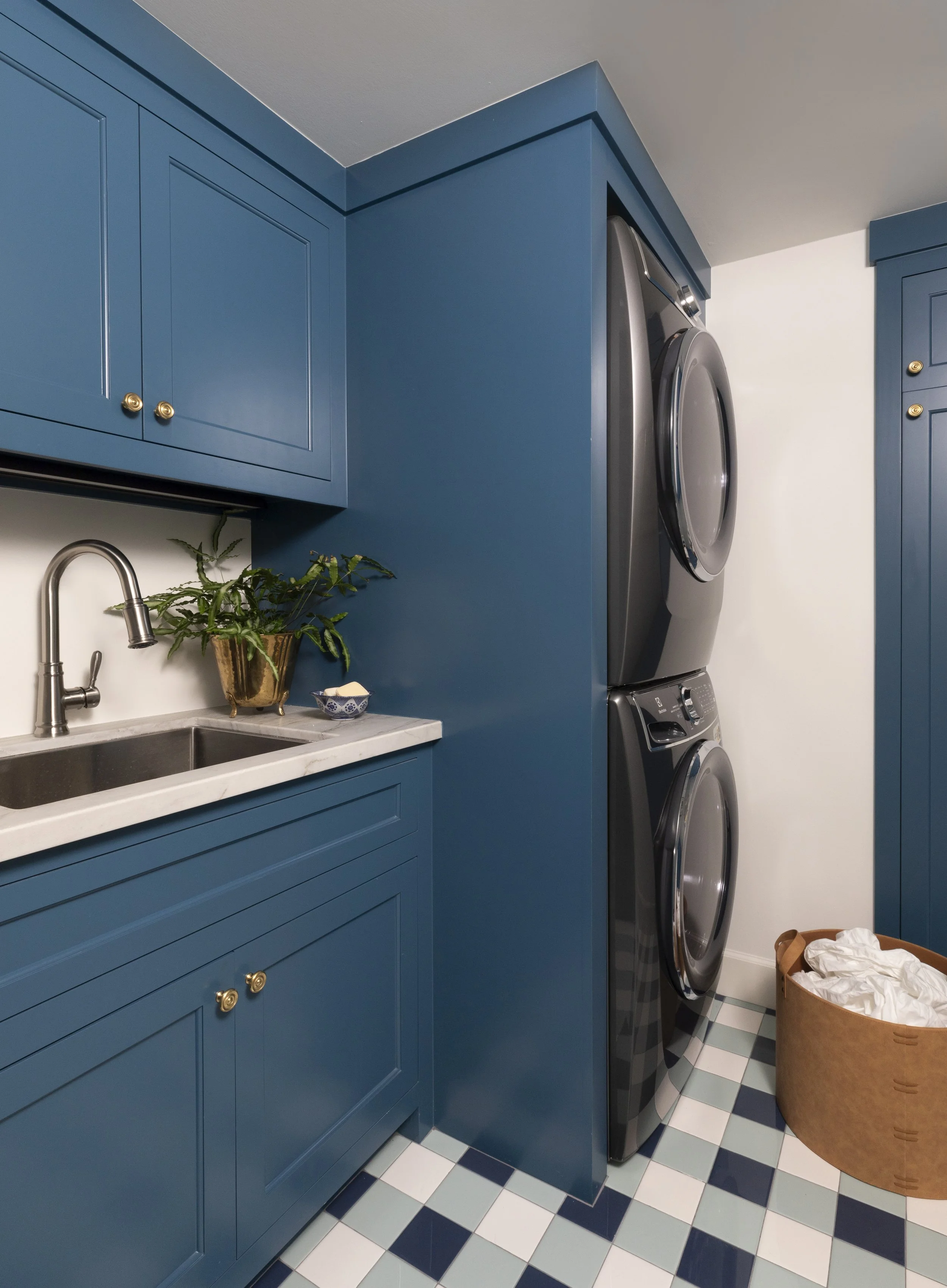
Mudroom & Laundry
Just beyond the sitting room, the original stained glass doors lead into the mudroom, now painted white to signal a subtle shift in function. Flooded with natural light, this space was designed to feel bright and open, but never stark. White walls and cabinetry form a clean backdrop, while the warmth of the wood floors, the texture of the stained glass, and custom cutouts in the built-in cabinet doors bring personality and softness to the room.
Storage was a priority here. Thoughtfully concealed cabinetry allows everyday necessities—cleaning supplies, bags, and household extras—to disappear, keeping the space calm and orderly without feeling over-designed. It’s practical, but still considered, proving that utility and beauty don’t have to compete.
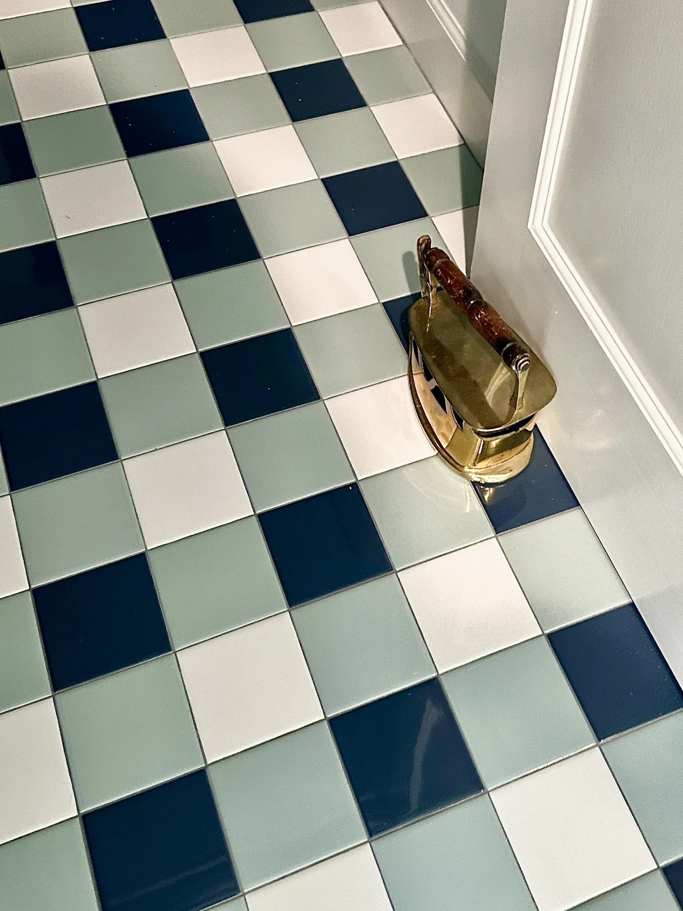
The laundry room is smaller in scale, which calls for a lighter touch. With limited opportunities for pattern, we introduced a blue gingham tile floor as a single moment of pattern play. It adds charm without overwhelming the room, complemented by blue cabinetry and crisp white walls that keep the space feeling fresh. A stacked washer and dryer maximizes efficiency, allowing the function to quietly do its job while the details carry the visual interest.
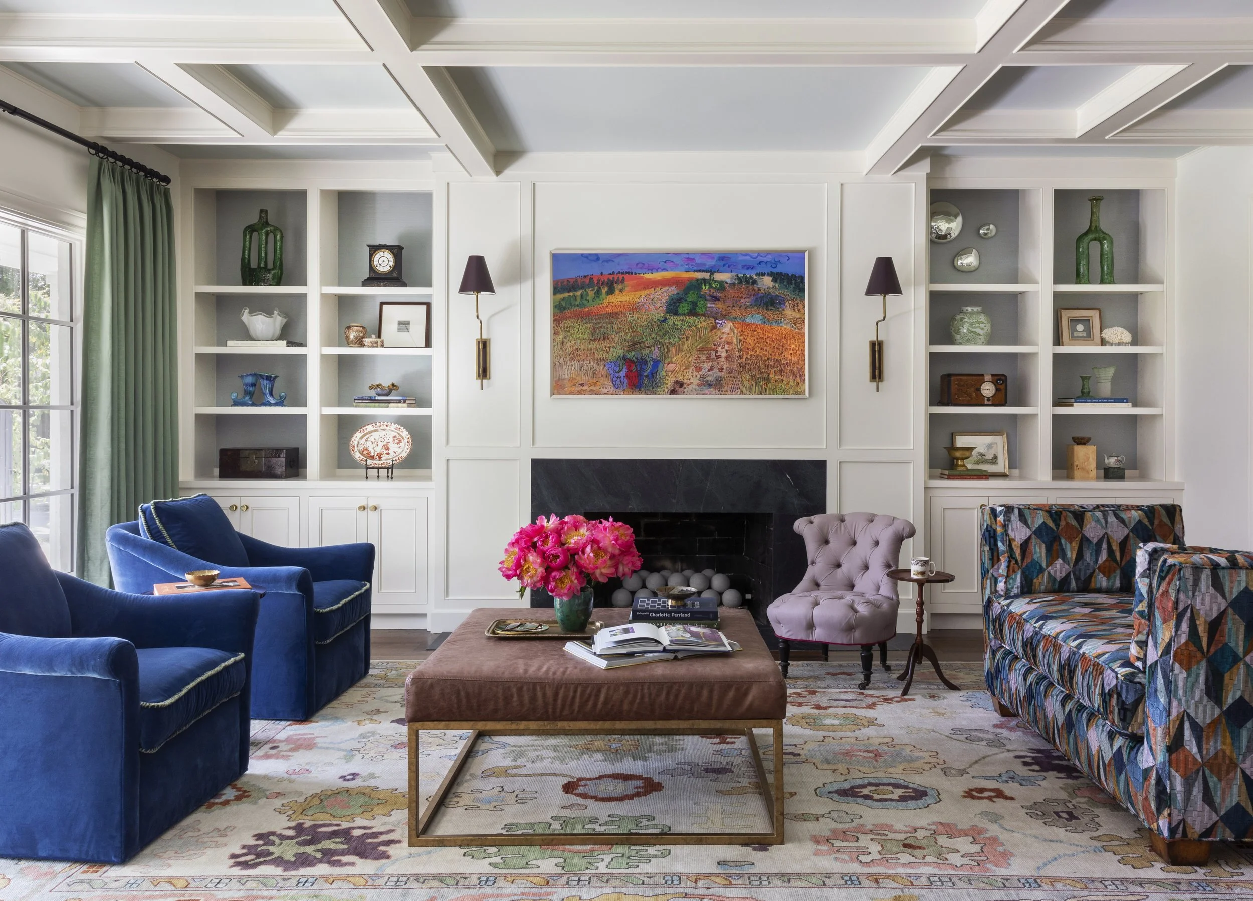
Living Room
The living room was shaped early on, beginning with a single inspiration image that the clients shared during initial conversations with Newberry Architecture. That image set the tone for the space and ultimately led to the addition of the coffered ceiling, a detail introduced during the renovation that now quietly anchors the room. It brings structure and rhythm overhead without overwhelming the openness of the space.
From there, the design unfolded around a daybed fabric that the client immediately connected with, its color palette becoming a starting point rather than an afterthought. The fireplace was reworked with new millwork and flanked by sconces, creating a focal point that feels elevated yet inviting. Urban Electric light fixtures reinforce the balance of classic form and modern ease, while a mauve accent chair sourced locally from FOUND adds softness and a subtle sense of place.
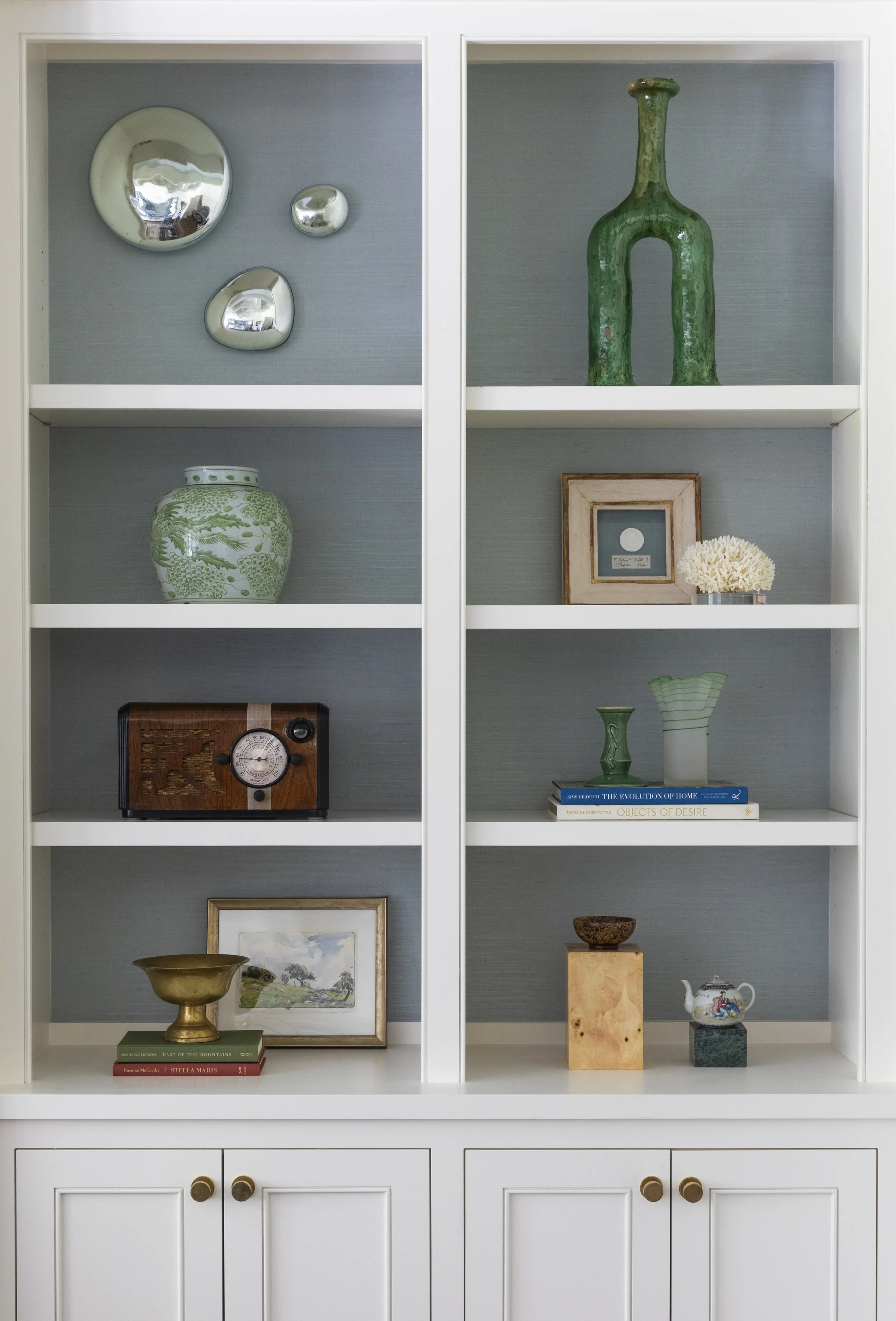
To keep the predominantly white walls and ceiling from feeling flat, we introduced pale blue grasscloth to the backs of the shelving and carried a coordinating blue paint into the recessed ceiling details. The effect is gentle but impactful, adding depth while softening the way light moves through the room. Bright blue lounge chairs bring in a vibrant energy, echoed by a vivid art piece above the fireplace, and the final layer comes through carefully curated accessories that give the space warmth and life without clutter.
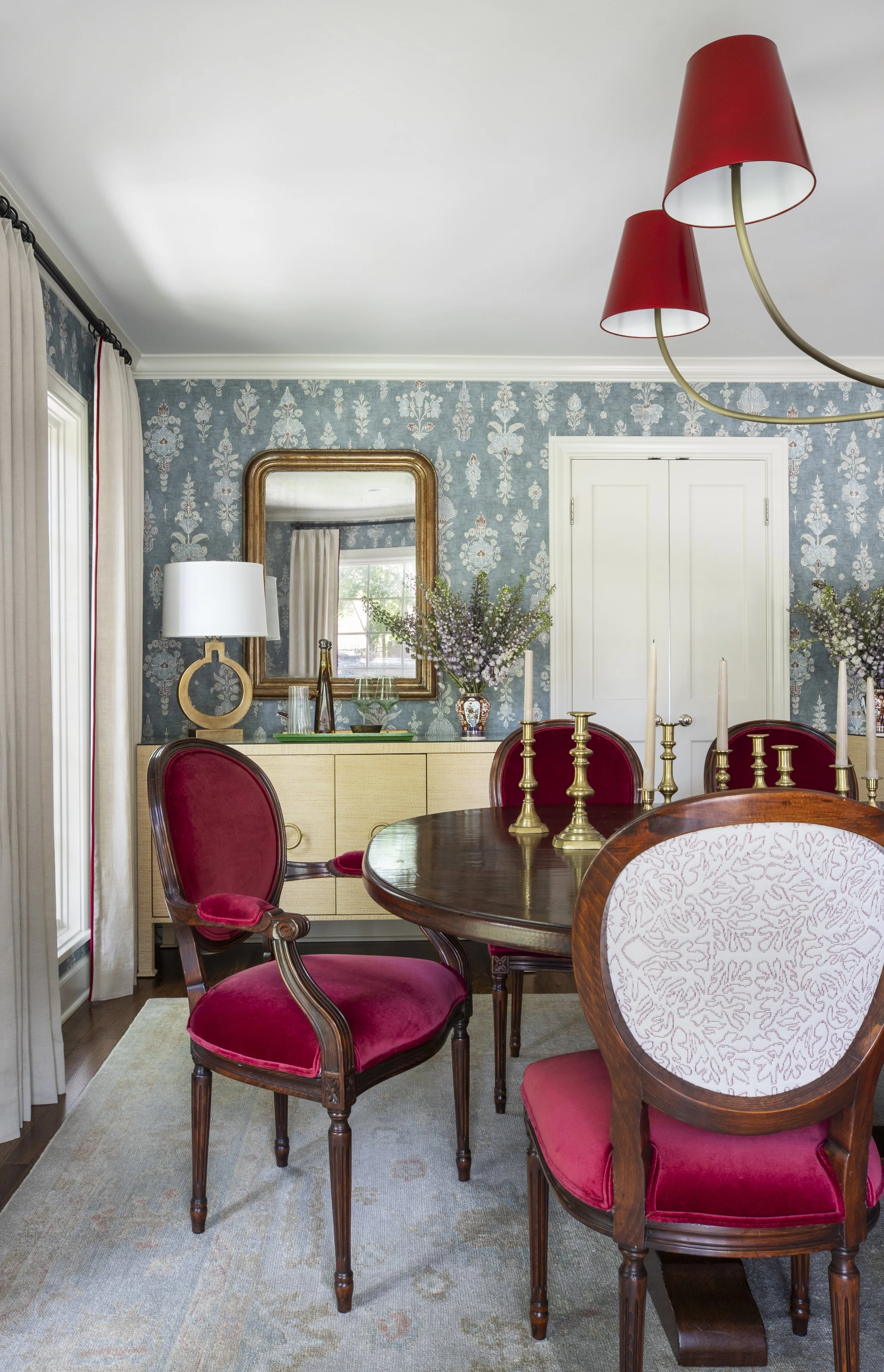
Dining Room
The dining room was one of the first spaces to take shape, guided by a Lewis & Wood catalog the clients brought with them as inspiration. As a British company, the brand held personal significance, reflecting both the clients’ roots and their love for pattern, tradition, and thoughtful detail. That connection made the decision feel natural rather than nostalgic.
We wrapped the room in Lewis & Wood wallpaper and carried a coordinating pattern onto the backs of the dining chairs, creating cohesion while allowing the furnishings to feel custom to the space. The existing dining table and chairs were refurbished, preserving pieces the clients already loved. The chair upholstery was treated with care: a durable deep red velvet on the seats for everyday use, paired with a more delicate white embroidered fabric on the backs, offering contrast and a subtle moment of surprise.
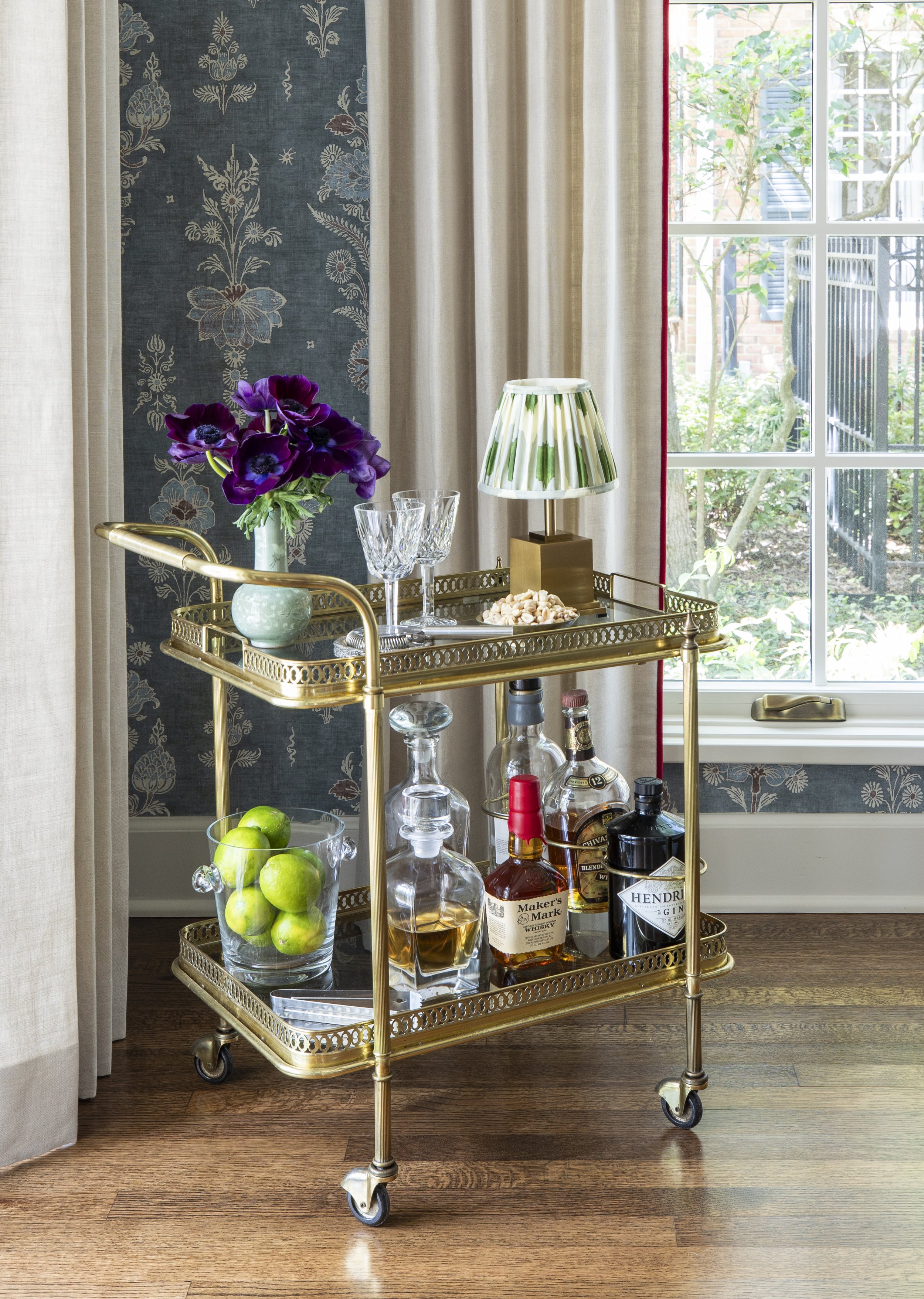
Urban Electric lighting with red shades hangs overhead, tying back to the chair upholstery and reinforcing the room’s rich palette. Two sideboards flank the double doors leading to the kitchen, providing ample storage while framing the transition between spaces. When the clients entertain, a bar cart tucked into the corner comes into play, turning the room into a place designed not just to dine, but to gather and linger.
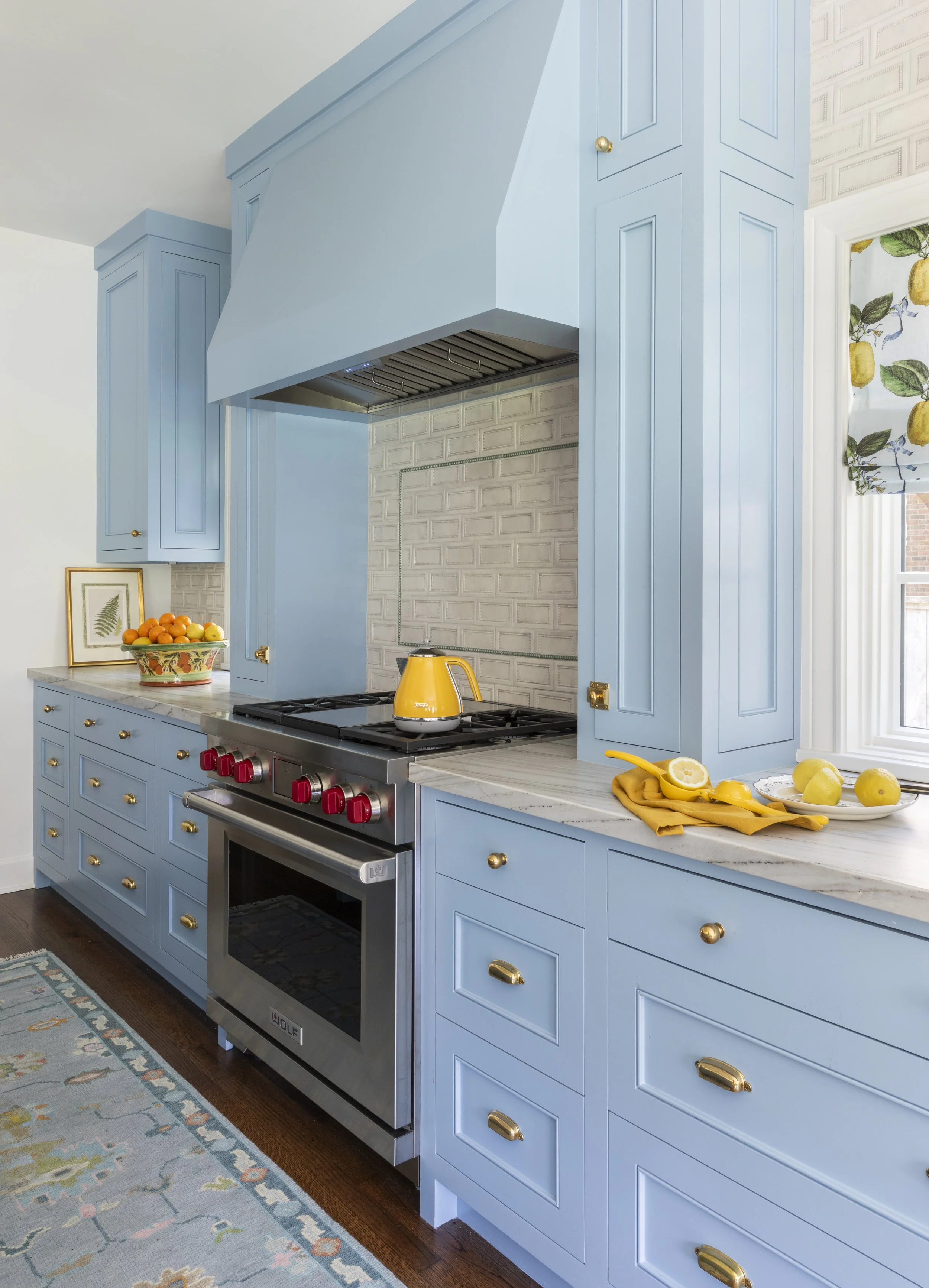
Kitchen & Breakfast Nook
The kitchen was designed with function leading the way. Newberry Architecture established a layout that felt intuitive and generous, and from there our team focused on refining the smaller, everyday details that make the space truly work for the client. We spent time with her early on, talking through how she cooks, what she reaches for most often, and which items needed dedicated storage. Measurements were taken, drawers were planned with intention, and cabinets were designed to support real routines rather than simply fill space.
One of those moments is a small upper cabinet above the counter, created specifically to house her toaster. Inside, a pull-out shelf allows for easy access, while a custom drawer below doubles as a breadbox, complete with a flip-up lid that becomes a built-in surface for slicing. These subtle touches reflect the broader approach throughout the kitchen, thoughtful, practical, and tailored.
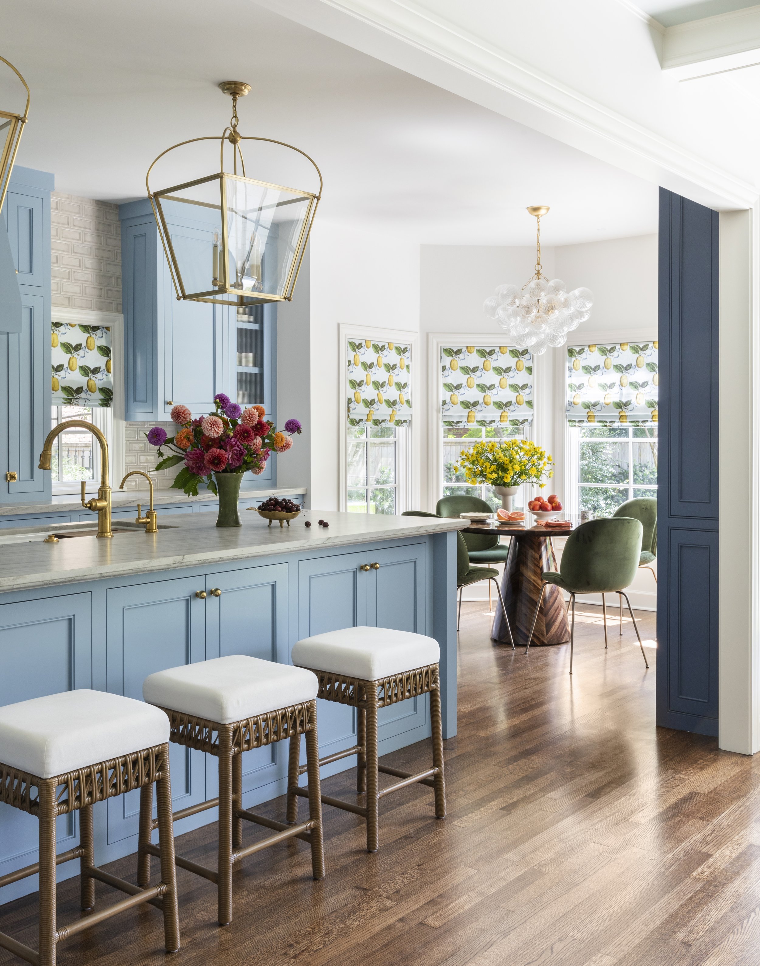
The countertops are a leathered Sea Pearl quartzite from Pomogranit, chosen for its depth and texture. The softened surface brings a sense of quiet sophistication and pairs beautifully with the coordinated plumbing fixtures and hardware, keeping the overall look clean and cohesive. A classic Wolf range grounds the space, nodding to tradition, while rattan barstools at the island introduce warmth and texture. The backsplash, finished in a custom beaded ceramic tile, was selected to gently contrast the light blue cabinetry, allowing the color to stand out without feeling overpowering.
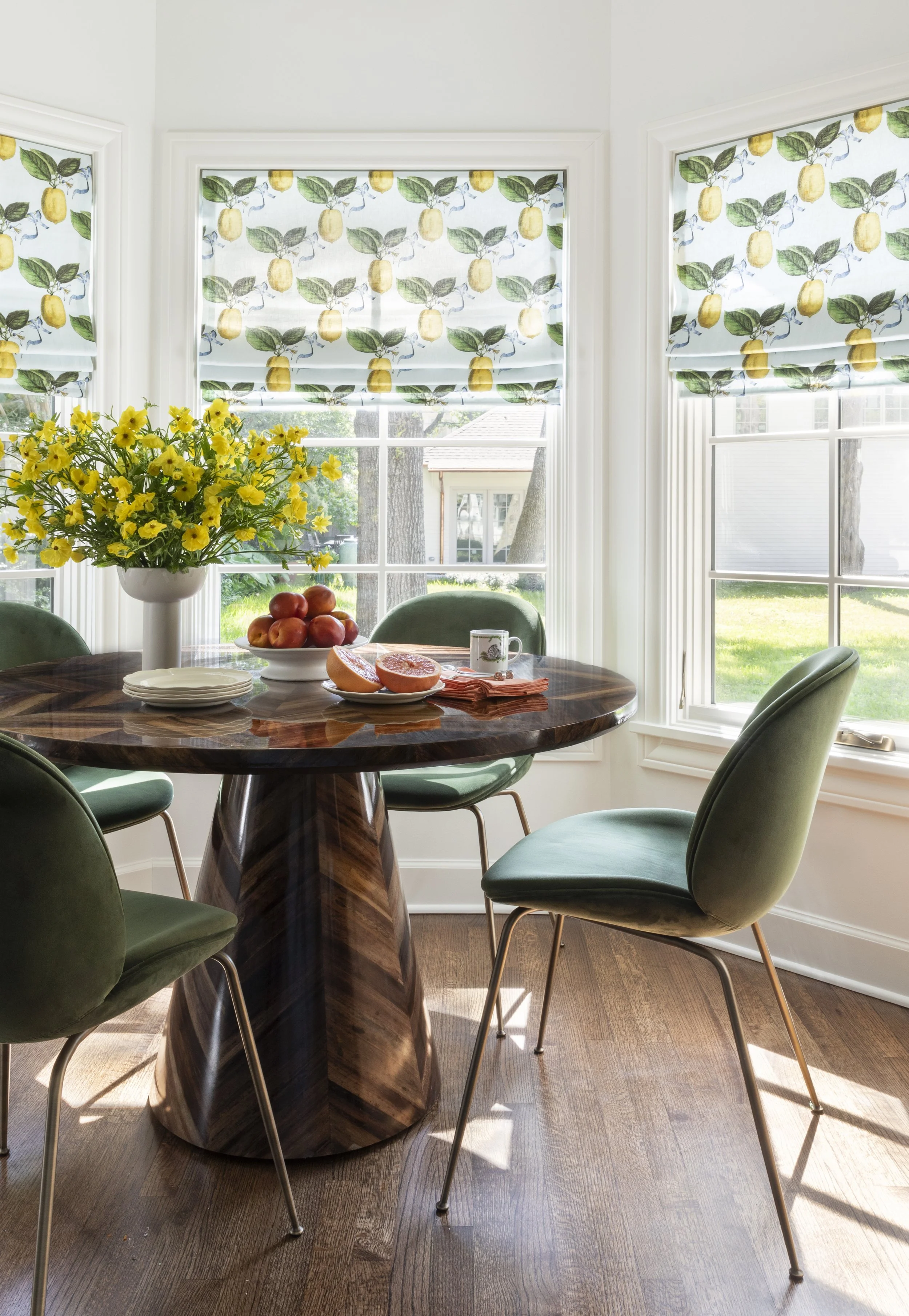
Open to the kitchen, the breakfast nook was expanded to better serve the family, especially for a client who loves to cook and gather everyone around the table. Reconfigured storage nearby helped make room for a larger dining area, turning the nook into a true extension of the kitchen rather than an afterthought. Soft blue shades echo the cabinetry, featuring a playful pattern of oversized lemons and leaves that brings a sense of ease and charm. A dark wooden round table anchors the space against the warmth of the hardwood floors, while muted green suede chairs add softness and comfort, making the nook a place where meals stretch into conversation.
Part One of this reveal is only the beginning. From the arrival sequence through the most public spaces of the home, each room was shaped with intention—rooted in history, guided by daily rituals, and refined through a thoughtful layering of old and new. Rather than overwrite the home’s original character, the design works in conversation with it, allowing existing elements, collected pieces, and subtle interventions to define how the house is experienced today. These first spaces set the rhythm for the entire project, establishing a sense of warmth, clarity, and quiet confidence from the moment you step inside.
In Part Two, we’ll move upstairs into the more private rooms of the house. Bedrooms and personal spaces continue this dialogue, shifting the focus from hospitality to retreat, and from shared moments to individual ones—where comfort, restraint, and personality take the lead.