
Spring Back to 1969
Step into a time capsule with us as we celebrate the arrival of Spring by delving into the vibrant world of interior design trends from the swinging 60s! Nestled in our treasure trove is a vintage Sherwin Williams catalog from the Spring of 1969, brimming with delightful insights and timeless tips that continue to inspire us at Emily June Designs.
Color isn't just a choice for us; it's a passion that fuels our creative process. Crafting harmonious color schemes is where art meets science, and we're thrilled to share with you how the color trends and techniques from over five decades ago still hold relevance and charm in today's design landscape. So, let's rewind the clock and explore the magic of color that transcends time!
HOW TO BUILD A COLOR SCHEME
““Revel in color. Use more than one. A single note of music played repeatedly gets tiresome; coupled with others, it can be a sym-phony. Nature never uses a single hue. The red of an apple melds many reds, the green in a forest glade blends a dozen tints and shades. A bed of zinnias flaunts all of the colors in the rainbow.””

Color Clinic Convo
This catalog includes a “Color Clinic” portion where Sherwin Williams experts answered some questions about using color in your home! Check out this good tip:
“Q: I've heard that an effective color scheme can be built around a single color. Aren't such schemes monotonous?”
“A: Not if you use light and dark values of one color plus black and white; one-color schemes can be dramatic. Of course the books, flowers, accessories and furniture also supply color to the room.”
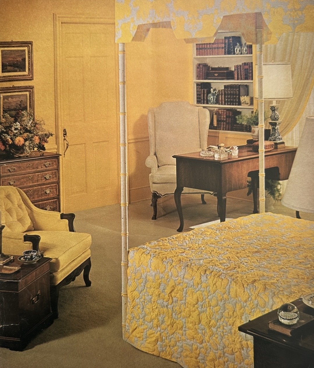
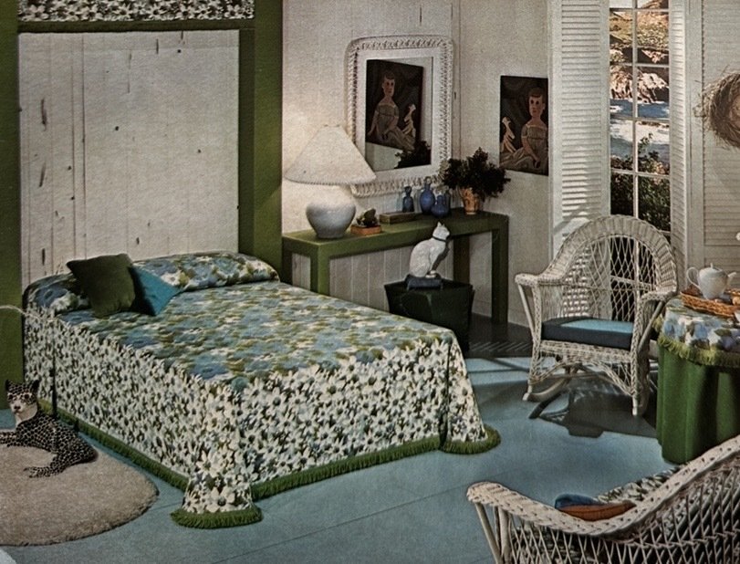
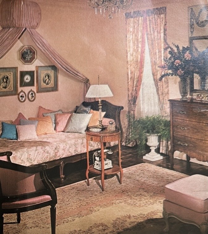
color can call forth many moods…
“Colors can call forth many moods; they may be gentle, serene, or provocative. Sharply contrasting colors animate, are bold; bright clear colors have gaiety; dark colors are subdued, and unexpected combinations have flair.
Look at the colors around you. Analyze the hues in the stem, leaf and flower of a rose. Listen to music and translate the sounds into colors. Do this and you will soon find that color has become one of the most exciting things in your life.
Shown here are three bedrooms, each with a color scheme built around a particular mood. Each hue used contributes to the spirit of the room.”

Groovy Kitchen Guidance
“Now any color goes in the kitchen. Make it blue, pink, green or orange. Just select one of the handsome hues in the Color Harmony Guide. Once the kitchen is painted add some finishing touches to impress your friends. Collect a picture or two, some colored bottles, framed menus, and make a collectors' corner... just for fun.”
Our main takeaway from this tip is “any color goes”!
As we bid farewell to our journey through the colorful trends of 1969, we're reminded that time may change, but good design endures. At Emily June Designs, we're always inspired by the past while creating for the present. It's like finding a vintage record that still sounds fresh on a modern turntable — a delightful blend of nostalgia and innovation.
So, whether you're reveling in the vibrant symphony of multiple colors or going for the drama of a monochromatic scheme with contrasting tones, remember that color is a canvas waiting for your personal touch. As we continue to explore the dynamic world of design, let's keep the spirit of creativity alive and embrace the joy that color brings to our spaces. Cheers to a groovy journey through time and style!